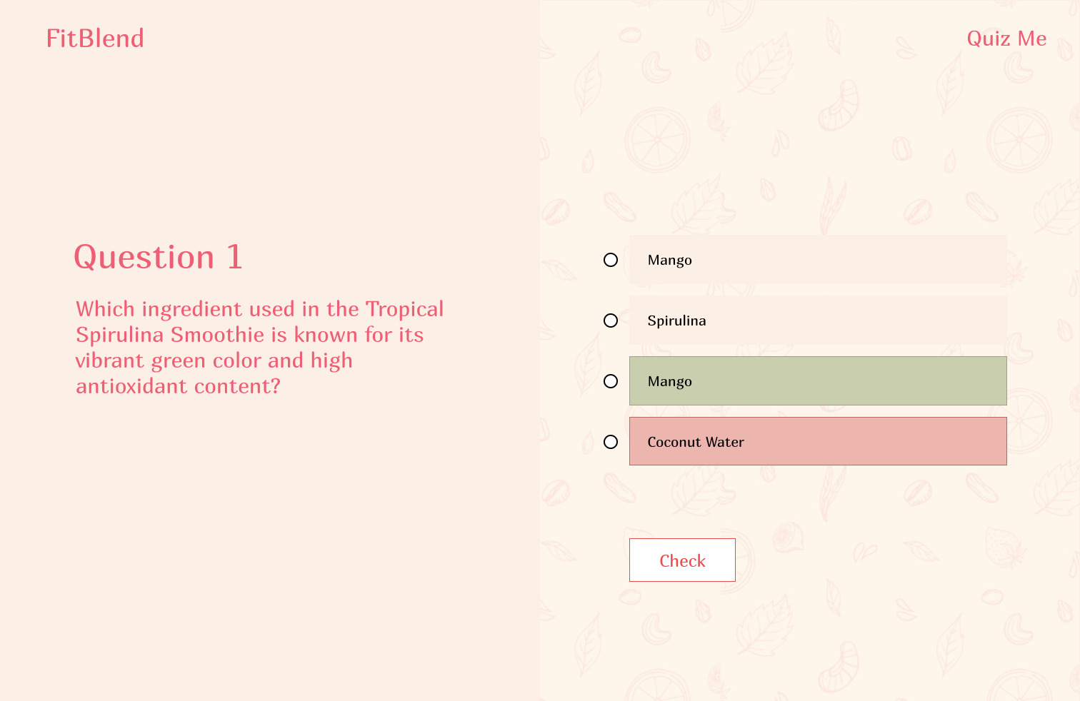
As part of my UI Design course at Columbia University, under the guidance of Professor Lydia Chilton, I embarked on an exciting project: designing the user interface for a smoothies app named FitBlend. This app not only provides nutritional information about smoothies but also engages users with a quiz to test their knowledge after they’ve explored our tutorial. In this article, I’ll walk you through the design process, highlighting the iterations and insights that shaped my final product.
You can explore the final project on my GitHub repository.
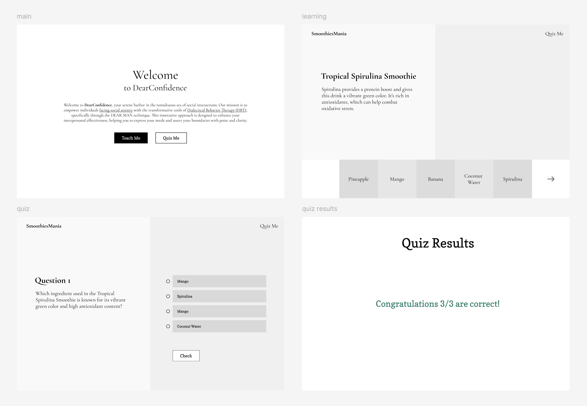
The journey began with a basic low-fidelity UI design, a rough outline to establish the flow and structure of the application. Here’s a snapshot of that initial design:
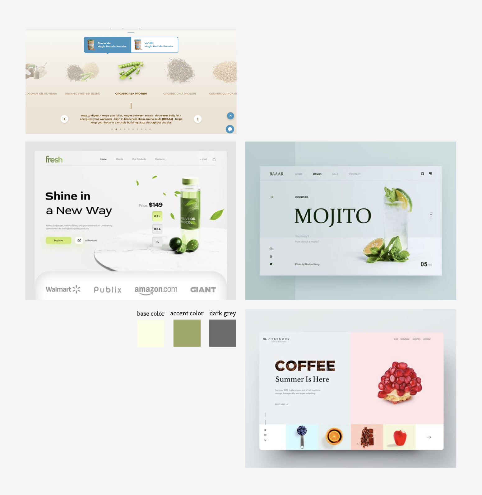
This early version gave me a starting point, but it was clear that the design needed refinement. To gather inspiration, I turned to Pinterest and Behance, platforms known for their rich design ideas. Here’s a glimpse of the inspiration that guided my next steps:
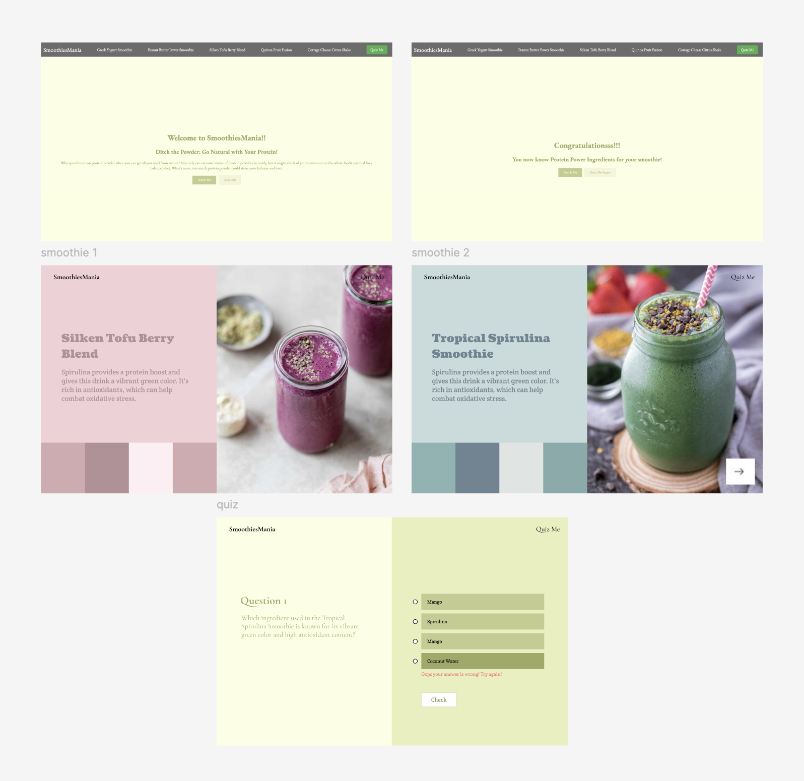
With inspiration in hand, I added color and imagery to the low-fidelity design. I chose a green color palette for the main theme, reflecting the fresh and vibrant nature of smoothies. Here’s how the design evolved:
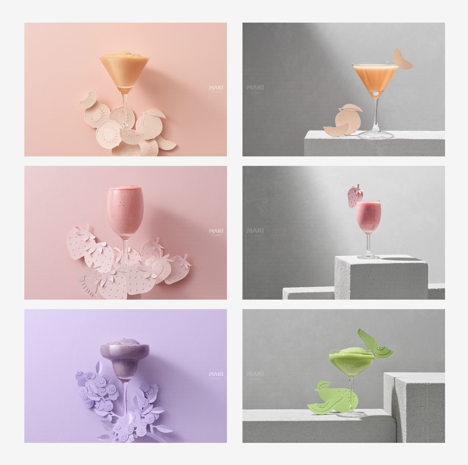
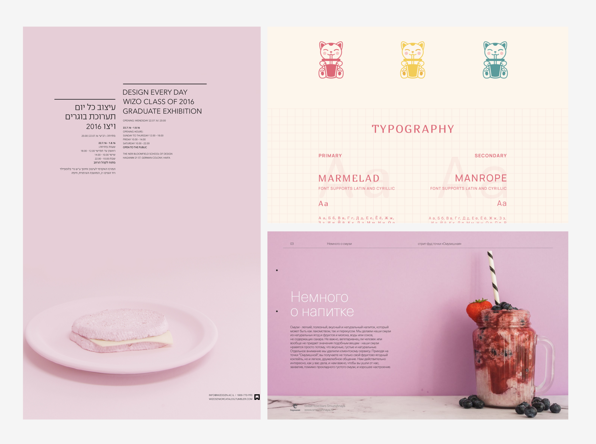
However, despite the improvements, the design still felt off. The pictures didn’t align well with the smoothie theme, leading to a disjointed user experience. I realized that cohesive and appealing images were crucial for a smoothie app. So, I searched for better images that matched the app’s aesthetic and theme. Here’s a collection of new visuals I found:
Armed with these new images, I revisited the design with a fresh perspective. My new inspiration, based on the updated images, was as follows:
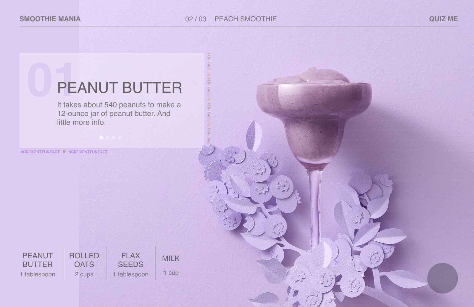
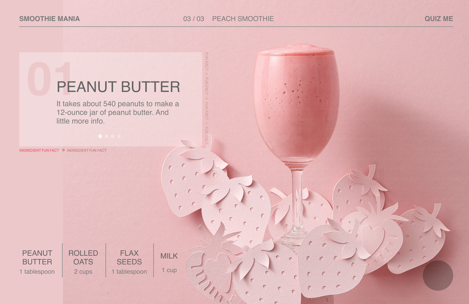
My goal was to present all smoothie ingredients on a single page, enhancing user experience by avoiding multiple clicks. I developed four variations of this feature to determine the best approach:
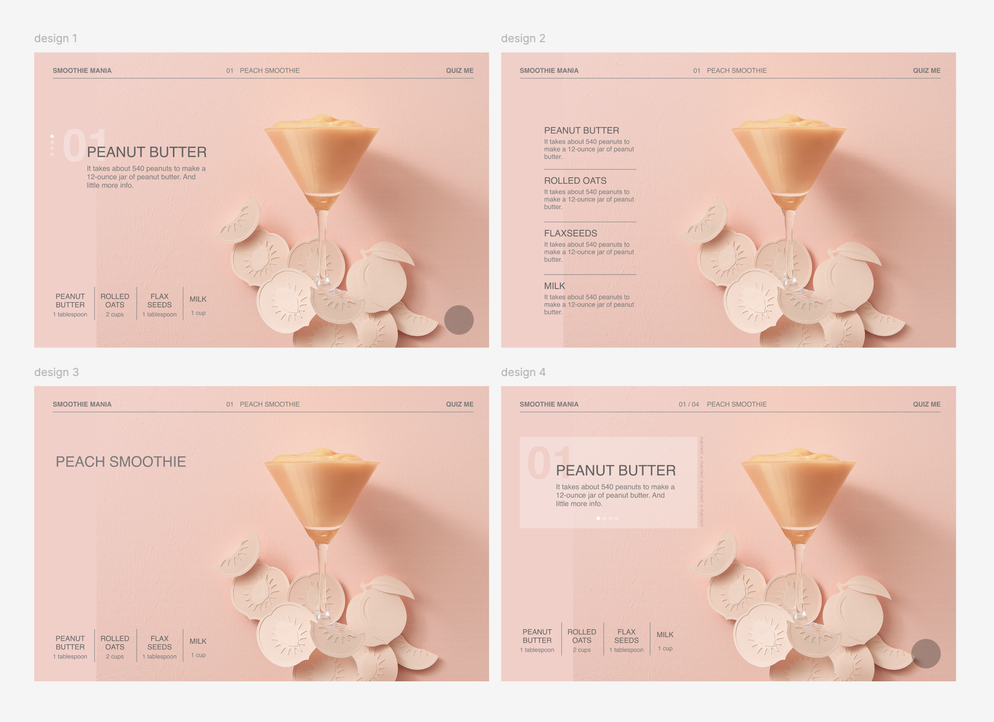
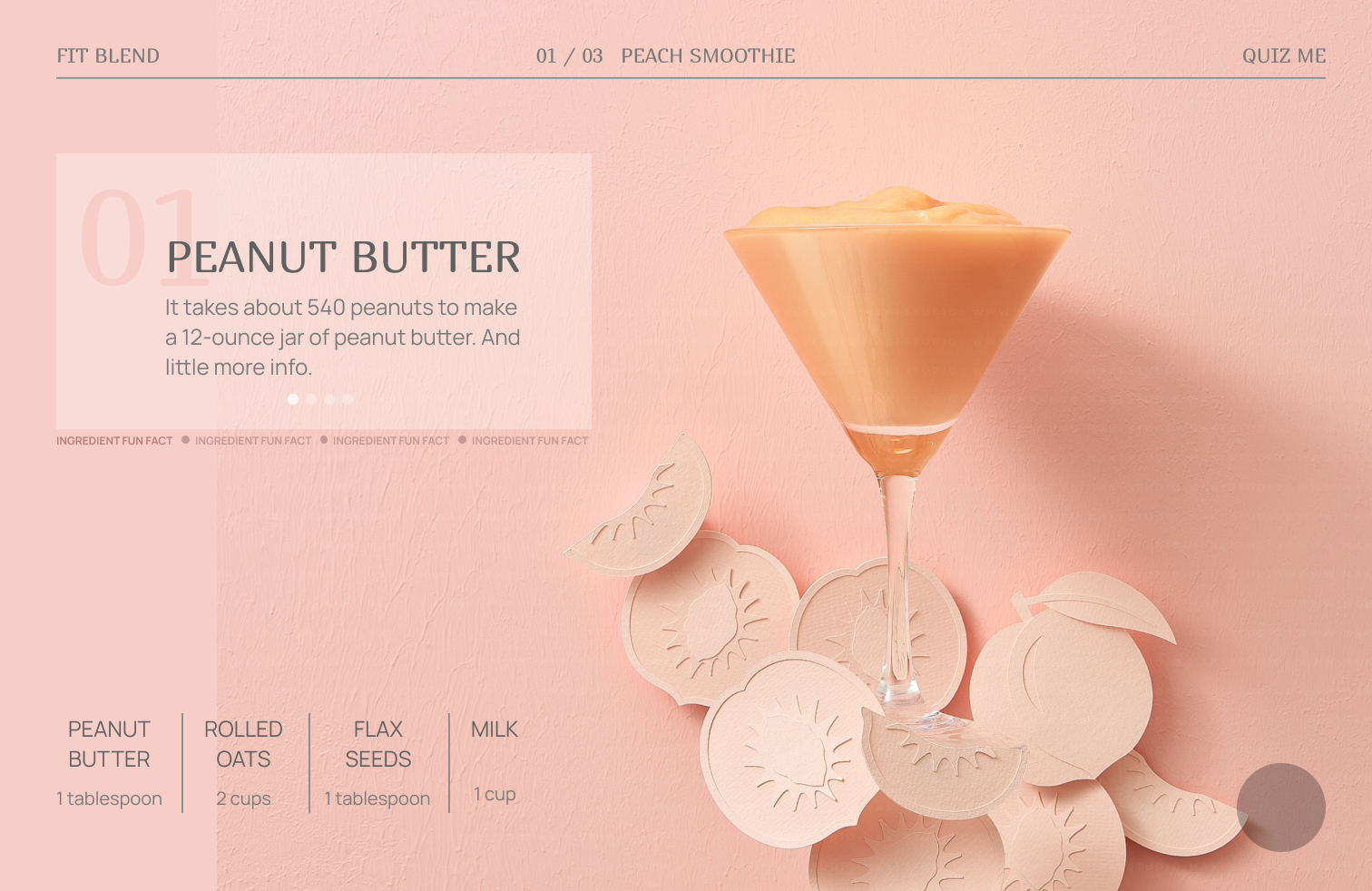
Among these options, the fourth variation stood out as the most aesthetically pleasing and functional. It featured subtle animations and a peach-and-pink color scheme that perfectly complemented my website theme.
The redesign journey was a rollercoaster of creativity and learning. From the initial rough sketches to the final polished product, each step was a testament to the iterative nature of UI design. I was thrilled with the outcome—a website that not only looks great but also provides a seamless and engaging user experience. Here’s a final view of the completed website:
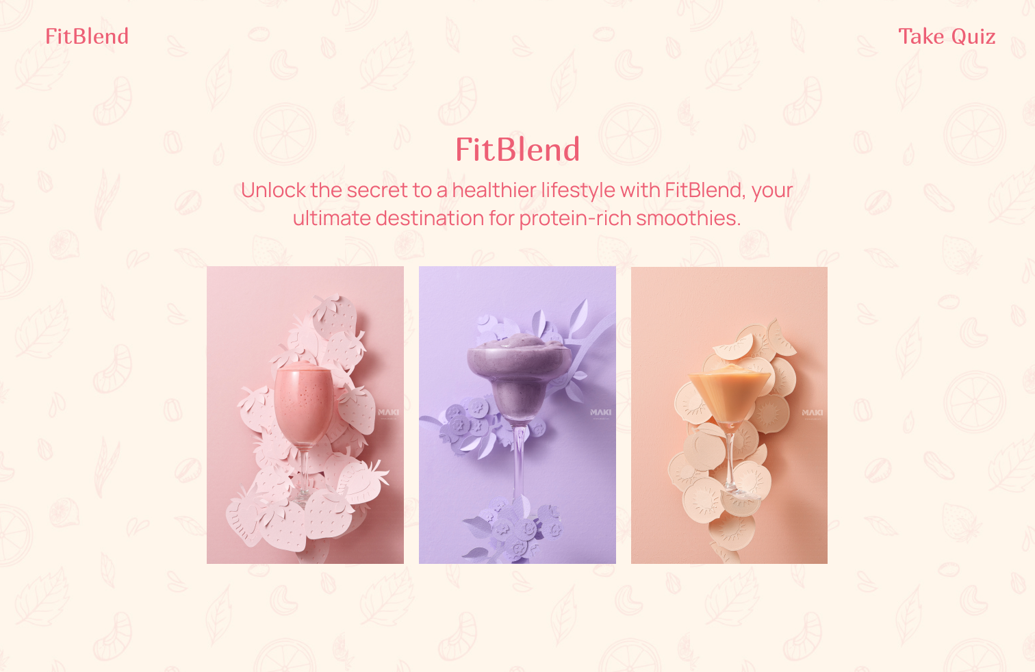
This project was a fantastic opportunity to apply and refine my UI design skills, and I’m proud of how the design evolved from concept to completion. It’s a reminder of how iterative design and user feedback can transform a simple idea into a fully realized product.