At BioCom, a dynamic multi-disciplinary community at SRM University in Chennai, India, we’re not just about connecting biology with technology—we’re about creating impactful solutions and innovations. When I took on the role of technical lead, I knew our website needed a major overhaul to reflect our community’s vibrant and forward-thinking spirit. What I didn’t expect was the whirlwind challenge we were about to undertake: a complete redesign in just two weeks.
You can explore the final project on our GitHub repository.
A Sprint Begins
With our existing website not quite hitting the mark, we launched into a high-energy design sprint. As the tech team lead, I worked closely with Sudhanshu Singh, the head of BioCom’s design team, to kick off this project. Our mission was clear: revamp the website to capture BioCom’s essence while enhancing user experience.
Day 1: Understanding and Defining
Our sprint started with a deep dive into understanding the needs and goals. On day one, we held an intensive meeting with experts from the life sciences team to get insights from their perspective. We dissected the problem space from various angles—business, user, and competitors—to clearly define our sprint’s objectives. We needed a website that resonated with BioCom’s brand and effectively communicated our brand.
Day 2: Sketching It Out
Day two was dedicated to unleashing creativity. The design team got hands-on with the Crazy 8s exercise—a rapid sketching technique where we sketched eight distinct ideas in eight minutes. This method pushed us to think beyond our initial concepts and explore a range of innovative solutions. The result was a treasure trove of diverse ideas, ready for further development.
Day 3: Deciding on Designs
With sketches in hand, we moved to the decision-making phase. Each design team member was assigned a specific page to lead. The goal was to refine these designs and ensure they were feasible from a technical standpoint. Team had frequent discussions with Sudhanshu to finalize layout inspirations and make necessary adjustments, ensuring that each design element was practical and aligned with our technical capabilities.
Day 4: Prototyping
On day four, it was time to turn our ideas into prototypes. The design team, guided by Sudhanshu, created detailed prototypes for each page. This phase involved iterative feedback sessions to ensure that the designs were polished and met our standards. We refined each page based on input from our design lead and prepared for the next phase.
Day 5: Validation
Validation was a crucial step. On day five, we presented our prototypes to the life sciences team for their final judgments. Their domain knowledge was invaluable, ensuring that the designs not only looked great but also aligned with the content and objectives of the site. Their feedback helped us make final adjustments and ensure that the website would effectively serve its intended purpose.
Days 6-8: Refining and Finalizing
The following three days were a whirlwind of refinement. We went back and forth between the design and life sciences teams, making necessary tweaks and ensuring everything was in place. By the end of day eight, we had a design that was ready for development and had satisfied all major stakeholders.
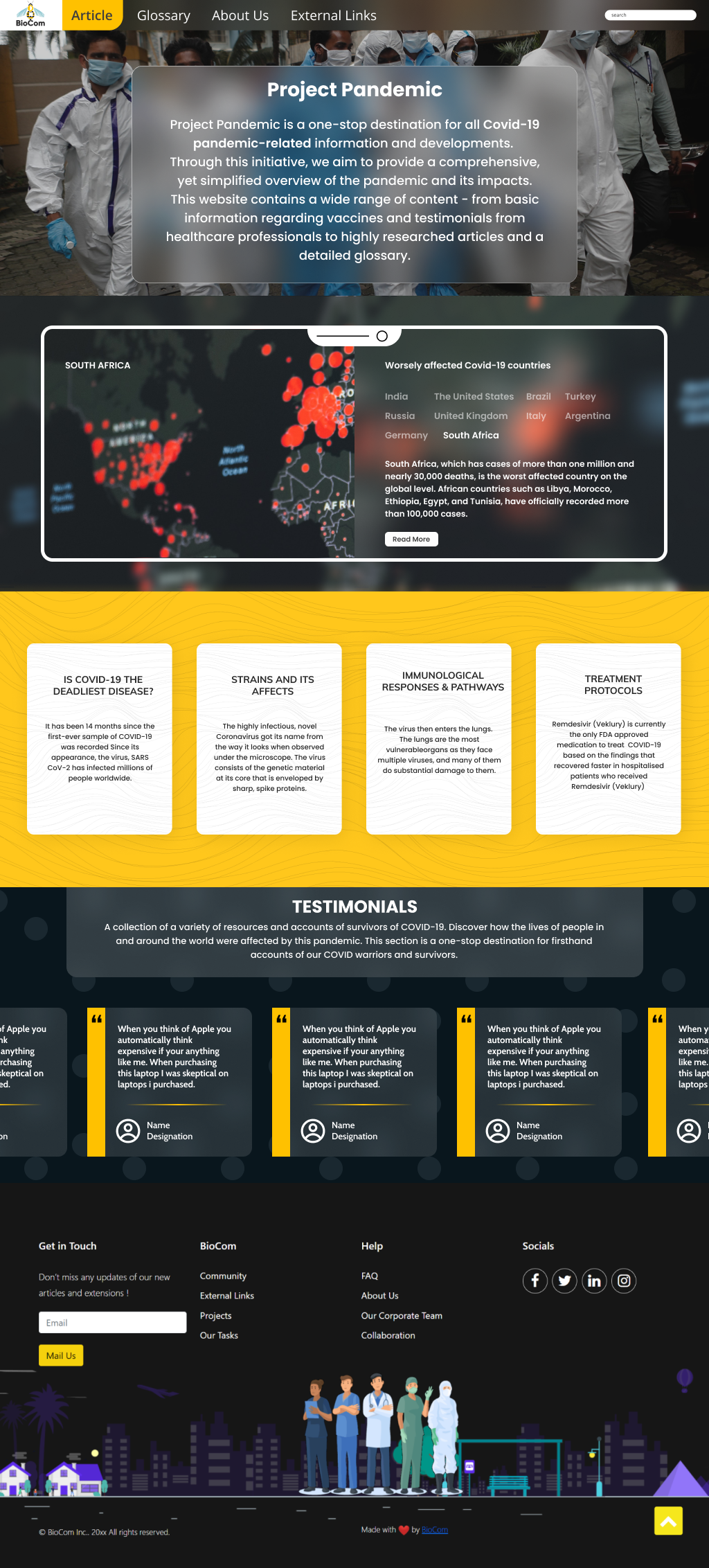
Our final website design was a significant leap from the old look. Here’s a sneak peek at the new design:

The screenshot below is purely for design, so feel free to ignore the Marvel-themed articles—though they are pretty cool, right? 😄

Training the Tech Team
While the design team was busy perfecting the UI, I focused on preparing the tech team. We had daily one-hour sessions covering the essentials of HTML, CSS, and JavaScript—critical for our chosen tech stack. I also introduced Git for version control, which was essential for smooth collaboration. These sessions were designed to get the tech team up to speed and ready to transform designs into a functional website.
Days 9-12: Coding in Action
With designs approved, it was time for the tech team to shine. Over four days, we converted our prototypes into a live website. Each team member was assigned a specific page to code. We held daily three-hour peer coding sessions where we built the HTML structure, applied CSS for styling, and established naming conventions. We also focused on making the site responsive, with group tutorials where I demonstrated my process for ensuring the website looked great on all devices.
The Big Reveal
After twelve intense days of design, coding, and collaboration, the website was ready to go live. It was a hectic but incredibly rewarding sprint, marked by creative breakthroughs, technical challenges, and the satisfaction of seeing our hard work come to fruition. The revamped BioCom website now stands as a testament to the power of teamwork, creativity, and dedication. It’s a proud moment for all involved, showcasing what can be achieved with passion and a clear vision.